
MOCA
Designing a better experience through research
The design process for creating a user-centered design experience.

About MOCA
MOCA is the Museum of Contemporary Art. There are 4 locations — 3 are located in Los Angeles, California and 1 is located in Moapa Valley, Nevada. In addition to exhibitions, MOCA engages audiences through events and educational programs.
The Challenge
The goal was to create a user-centered website that addressed users’ needs, goals and pains; to improve the user experience by making it easier for users to find information and accomplish their tasks.
My Role
I was responsible for the User Experience (UX) and User Interface (UI) Design.
I Conducted/Designed
User Interviews
Expert Review
Card Sorting Research
Wireframe
Prototype
Usability Testing
User Interface Design
Visual Design
Design Process
Empathize
User Interviews
Expert Review
Card Sorting Research
Define
The goal
Ideate
Wireframe
Prototype Wireframe
Usability Testing with Users
Validate + Iterate
Design
User Interface
Interaction
Visual
Wireframe
A low-fidelity prototype was created for conducting usability testing. The goal was to detect problems in the early stages of design.

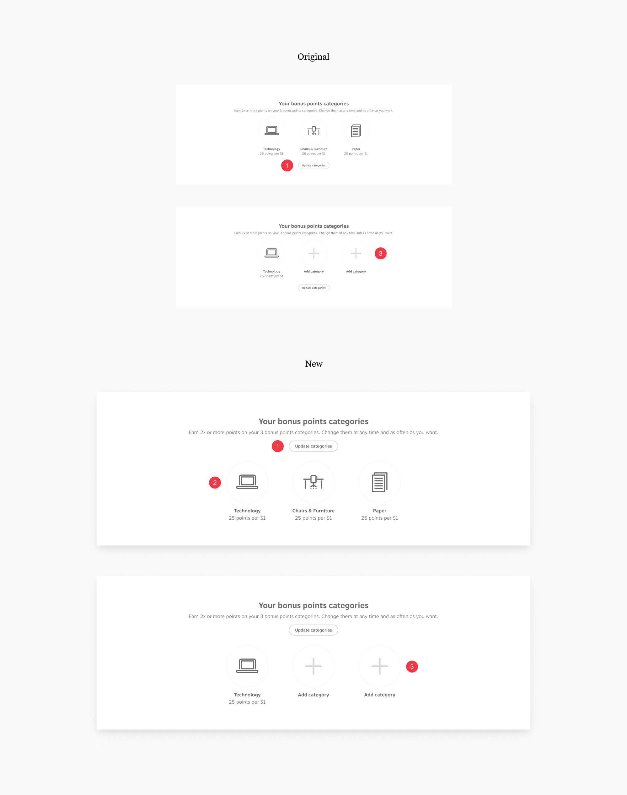
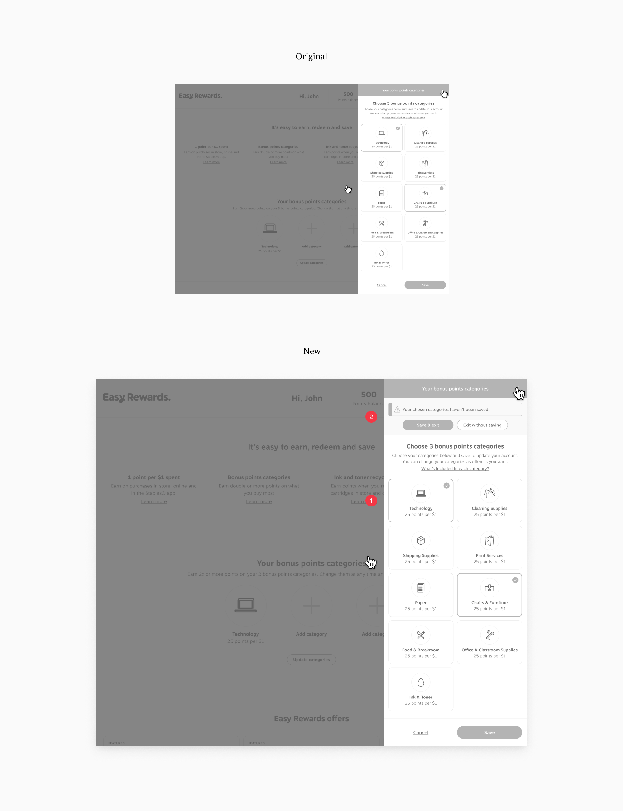
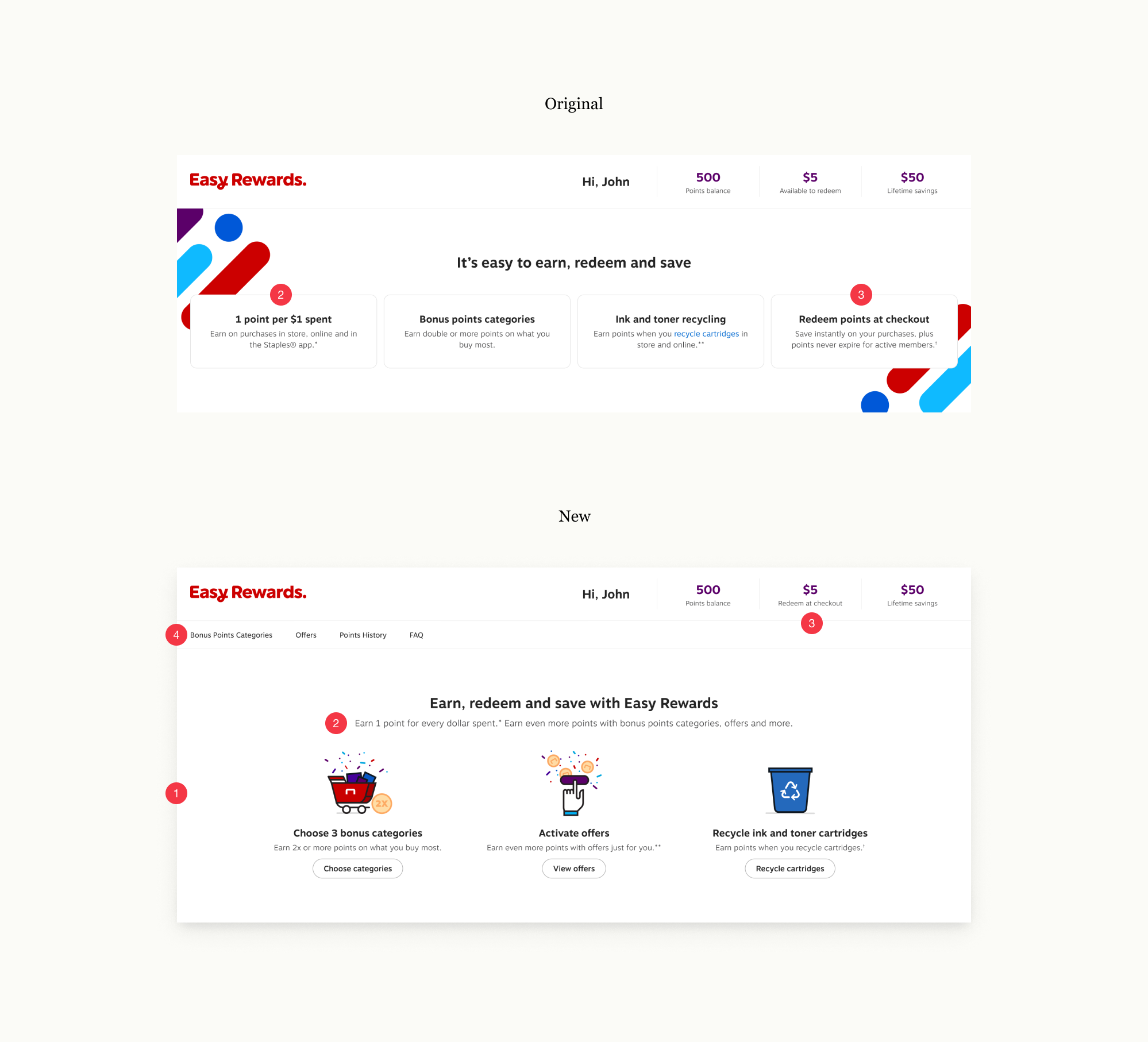
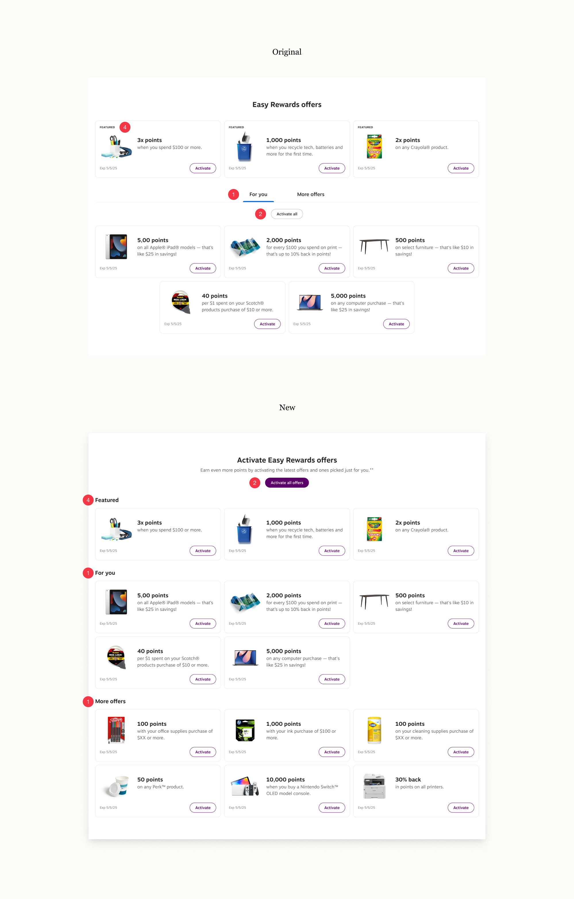
According to user interviews, primary goals were: 1) Hours of operation. 2) Admission price. And 3) Parking. All of which can be found under Visit, making the label, high priority. In the original design, Visit is located on the right, making it the last label in the global navigation. Understanding that users read/scan from left to right, the Visit label was moved to the left, making it easier to find.
“Activities available” and “calendar of events” were also highly sought after information. In the original design, activities and events were found under Programs. After conducting a card sorting research, findings show that a very low percentage of users were categorizing activities and events under Programs. Instead, a majority of users gravitated towards the Events label. To help users find information and reduce confusion, Programs was changed to Events.
Through usability testing, users did not realize there were 4 locations associated to this museum. This information was clearly stated.
Usability Test #1
A low-fidelity prototype was created for conducting usability testing. The goal was to detect problems in the early stages of design.
According to user interviews, primary goals were: 1) Hours of operation. 2) Admission price. And 3) Parking. All of which can be found under Visit, making the label, high priority. In the original design, Visit is located on the right, making it the last label in the global navigation. Understanding that users read/scan from left to right, the Visit label was moved to the left, making it easier to find.
“Activities available” and “calendar of events” were also highly sought after information. In the original design, activities and events were found under Programs. After conducting a card sorting research, findings show that a very low percentage of users were categorizing activities and events under Programs. Instead, a majority of users gravitated towards the Events label. To help users find information and reduce confusion, Programs was changed to Events.
Through usability testing, users did not realize there were 4 locations associated to this museum. This information was clearly stated.
Usability Test #2
A low-fidelity prototype was created for conducting usability testing. The goal was to detect problems in the early stages of design.
According to user interviews, primary goals were: 1) Hours of operation. 2) Admission price. And 3) Parking. All of which can be found under Visit, making the label, high priority. In the original design, Visit is located on the right, making it the last label in the global navigation. Understanding that users read/scan from left to right, the Visit label was moved to the left, making it easier to find.
“Activities available” and “calendar of events” were also highly sought after information. In the original design, activities and events were found under Programs. After conducting a card sorting research, findings show that a very low percentage of users were categorizing activities and events under Programs. Instead, a majority of users gravitated towards the Events label. To help users find information and reduce confusion, Programs was changed to Events.
Through usability testing, users did not realize there were 4 locations associated to this museum. This information was clearly stated.
User Interface 1.0
A low-fidelity prototype was created for conducting usability testing. The goal was to detect problems in the early stages of design.

According to user interviews, primary goals were: 1) Hours of operation. 2) Admission price. And 3) Parking. All of which can be found under Visit, making the label, high priority. In the original design, Visit is located on the right, making it the last label in the global navigation. Understanding that users read/scan from left to right, the Visit label was moved to the left, making it easier to find.
“Activities available” and “calendar of events” were also highly sought after information. In the original design, activities and events were found under Programs. After conducting a card sorting research, findings show that a very low percentage of users were categorizing activities and events under Programs. Instead, a majority of users gravitated towards the Events label. To help users find information and reduce confusion, Programs was changed to Events.
Through usability testing, users did not realize there were 4 locations associated to this museum. This information was clearly stated.
Iteration #1
A low-fidelity prototype was created for conducting usability testing. The goal was to detect problems in the early stages of design.
According to user interviews, primary goals were: 1) Hours of operation. 2) Admission price. And 3) Parking. All of which can be found under Visit, making the label, high priority. In the original design, Visit is located on the right, making it the last label in the global navigation. Understanding that users read/scan from left to right, the Visit label was moved to the left, making it easier to find.
“Activities available” and “calendar of events” were also highly sought after information. In the original design, activities and events were found under Programs. After conducting a card sorting research, findings show that a very low percentage of users were categorizing activities and events under Programs. Instead, a majority of users gravitated towards the Events label. To help users find information and reduce confusion, Programs was changed to Events.
Through usability testing, users did not realize there were 4 locations associated to this museum. This information was clearly stated.
Iteration #2
A low-fidelity prototype was created for conducting usability testing. The goal was to detect problems in the early stages of design.
According to user interviews, primary goals were: 1) Hours of operation. 2) Admission price. And 3) Parking. All of which can be found under Visit, making the label, high priority. In the original design, Visit is located on the right, making it the last label in the global navigation. Understanding that users read/scan from left to right, the Visit label was moved to the left, making it easier to find.
“Activities available” and “calendar of events” were also highly sought after information. In the original design, activities and events were found under Programs. After conducting a card sorting research, findings show that a very low percentage of users were categorizing activities and events under Programs. Instead, a majority of users gravitated towards the Events label. To help users find information and reduce confusion, Programs was changed to Events.
Through usability testing, users did not realize there were 4 locations associated to this museum. This information was clearly stated.
User Interface 2.0
A low-fidelity prototype was created for conducting usability testing. The goal was to detect problems in the early stages of design.

Design Toolkit

User Interface
The goal was to make it easier for users to find information and achieve primary goals while eliminating pain points.


Additional Work

Website

Retail + Digital

Website

Print + Billboard

Mobile App

Mobile App

Microsite