
CVS Health
Redesigning a pharmacy app to address user needs
Creating an efficient user interface, by focusing on information hierarchy.

About CVS Health (The Project?)
Staples Promotional Products offers custom printing on promotional products. They carry a large selection of products with fast turnarounds and low minimums.
The Challenge
The goal was to streamline the user experience, enabling users to achieve their goals with minimal effort and friction.
My Role
I was responsible for the User Experience (UX) and User Interface (UI) Design.
I Created/Designed
User Flow
Wireframe
Research Questions
Interaction Design
User Interface Design
Visual Design
The Team???
Director of UX / Director of Digital Product Management / Product Manager / Art Director
Design Process
Empathize
Focus Groups
Define
The Goal
Ideate
User Flow
Wireframe + Information Hierarchy
Wireframe
Usability Testing with Users
Validate + Iterate
Design
User Interface
Interaction
Visual
Project #1
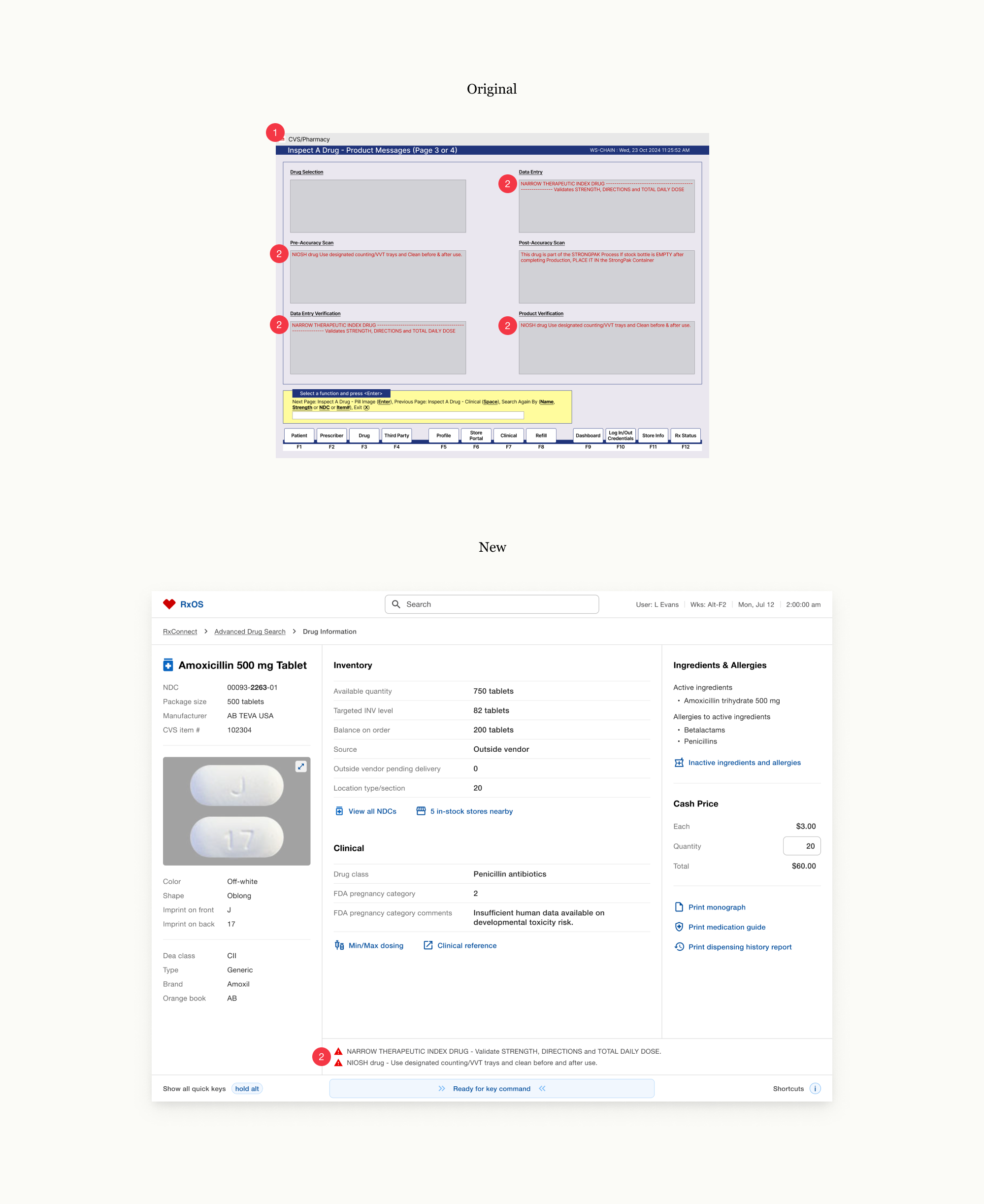
Drug Information
The original screens were inefficient. Information was difficult to access, content was redundant, and related information was scattered.

Uncovered User Pain Points
The product image was frequently needed, but because it was buried on the fourth screen, users had to bypass the first three every time.
Screen 3 was seldomly used. It was an unnecessary hurdle to the more frequently accessed fourth screen.
Users identified “Cash Price” visibility would be beneficial.
Ambiguous terminology led to user confusion.
Identified UX/UI Friction
The lack of visual hierarchy required excessive cognitive effort.
Related content was not positioned in close proximity.
Redundant information increased cognitive load.
Irrelevant data contributed to information overload.
New Solution
Single-Screen Design
Four screens were consolidated into one, reducing cognitive load and increasing efficiency.
The original user flow was inefficient, requiring users to navigate four separate screens to find information. The new single-screen design eliminated navigation friction and improved discoverability. Information was instantly accessible resulting in a faster experience.
The following design decisions optimized the user experience:
The simplified single screen design, improved discoverability and resolved several user pain points.
Essential information was moved to the top of the screen to ensure immediate accessibility.
Added navigation links for “All NDCs” and “In-Stock Stores Nearby” to help users conveniently resolve inventory issues without having to leave the page.
Bottom navigations were repositioned near related content for efficiency.
Collaborated with the business team to refine and finalize terminology to resolve user confusion.
Added “Cash Price” with the ability to conveniently calculate total cost based on inputted quantity.
Redundant “drug information” and “product messages” were eliminated to reduce cognitive load.
Project #2
Production Workflow
The production workflow is the most time-intensive phase of prescription fulfillment. Technicians are expected to scan, count, image, fill, label and bag with speed and accuracy.
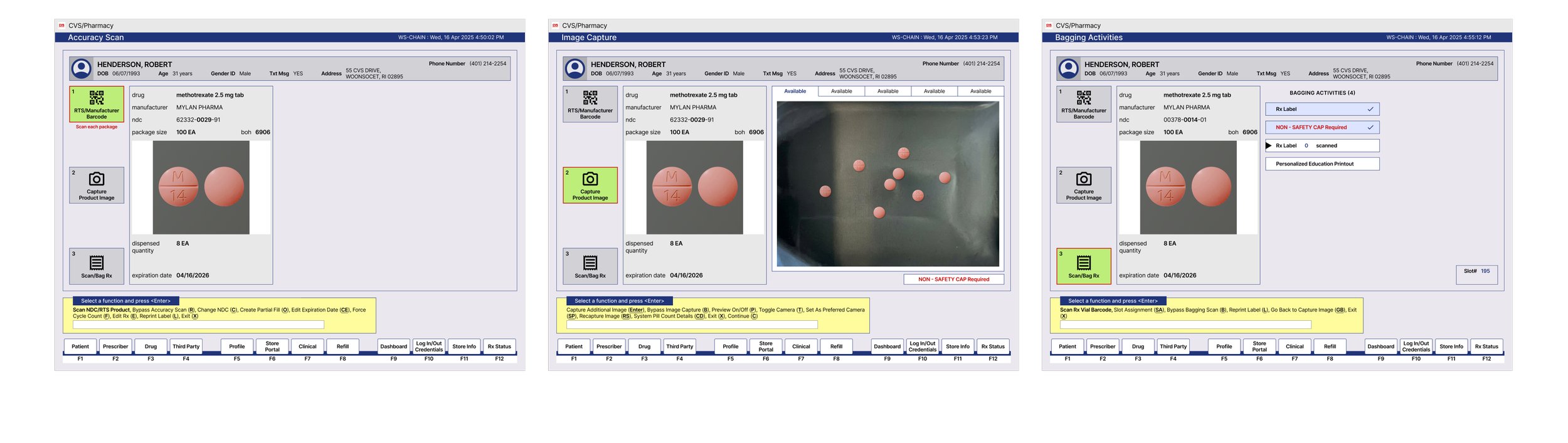
Creating a quick experience was the main priority.
Every decision, physical and digital, needed to support a fast, frictionless experience requiring the least amount of effort.
New Solution
Action-Driven Experience
Keyboard interactions slowed down users. The new experience was streamlined with AI and automation.
The original design required extensive movements and actions. Users were constantly switching between product handling and keyboard interactions. The new experience only required users to interact with the product. Automating keyboard interactions resulted in a more efficient experience.
Project #3
Product Verification
The original design lacked visual hierarchy. Users did not know where to focus. There was no distinction between information that must be reviewed and optional information.
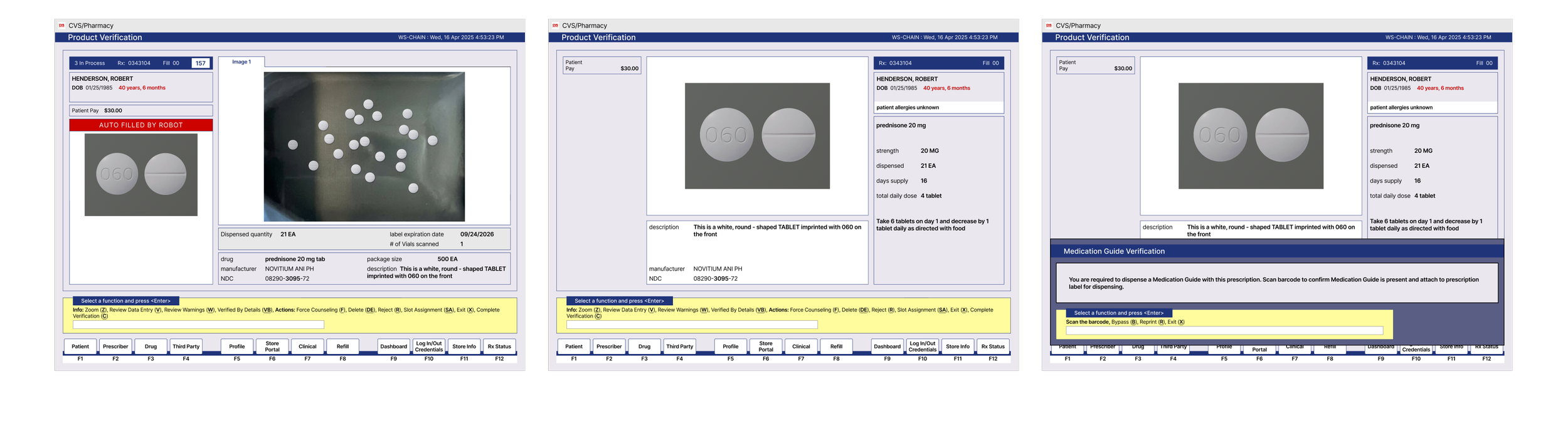
Determining goals through user research
Determined essential vs optional information to prioritize content appropriately. Users frequently needed to enlarge the captured image, optimizing this action was a high priority.
The screen lacked instructions, making it difficult for new users.
The lack of visual hierarchy, forced users to focus across multiple areas of the screen, creating visual fatigue and increasing completion time.
Recognizing that different use cases required distinct information, a comprehensive design was necessary.
Ensuring worst case scenarios were accounted for and not an afterthought.
New Solution
Implementing Visual Hierarchy
Information requiring mandatory review was centralized, reducing cognitive load and accelerating task completion.
The original screen lacked focus, requiring users to scan the entire page to find necessary information. By establishing a strong visual hierarchy, visual search was reduced and the primary task was quickly completed.
The following design decisions optimized the user experience:
Didn’t want scrolling
Least amount of interaction required. Reduced required interactions.
Reduced thinking. Didn’t want technicians to do math.
Easily pivot if there was an issue.
Important information was upfront and centered (currently hidden in the side)
Automation
Project #4
Return to Stock
A Return to Stock can be triggered at different points of the application. The original application had a different experience for each entry point, resulting in an inconsistent experience and significant maintenance efforts.
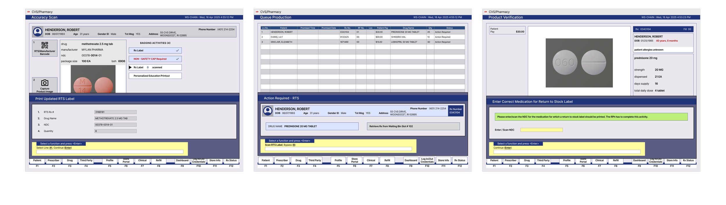
A versatile design was created to increase efficiency and reduce maintenance efforts.
Recognizing that different use cases required distinct information, a flexible design was needed for a comprehensive solution.
New Solution
Unifying Multiple Return to Stock Use Cases
One versatile design was created for three different use cases, providing a consistent and familiar experience.
The original user flow was inconsistent and complicated. The new design maintained an 80% baseline consistency with a 20% variance to accommodate the different use cases while reducing development effort.
The following design decisions optimized the user experience:
Didn’t want scrolling
Least amount of interaction required. Reduced required interactions.
Reduced thinking. Didn’t want technicians to do math.
Easily pivot if there was an issue.
Important information was upfront and centered (currently hidden in the side)
Automation
USER RESEARCH
Uncovered User Pain Points
Information was difficult to access. Because screen 3 was rarely used, it was a pain point for users to skip over this screen to get to the next screen, which is often used
User needed to skip 3 screens to get to this screen #4
Wanted information that was not available.
Confusing verbiage
Screen 3 was rarely used
most used information was not prioritized
UX/UI AUDIT
Identified UX/UI Friction
Redundant information
Things were not organized together
Related information was not positioned in close proximity
Some info was unnecessary and confusing
No visual hierarachy
Did not know what to prioritize
EXPLORED
UX Opportunities
Create visual hierarchy based on user needs
Simplify the user flow
Clarify verbiage and content
Eliminate unnecessary information
Reduce cognitive load
Create efficiency
SOLUTION
Four screens were consolidated into one, reducing cognitive load and increasing efficiency.
The original user flow was inefficient, requiring users to navigate four separate screens to find information. The new single-screen design eliminated navigation friction and improved discoverability. Information was instantly accessible resulting in a faster experience.
The original user flow was inefficient, requiring users to navigate four separate screens to find information. The new single-screen design reduced user effort and improved discoverability.
NEW DESIGN
4 screens were consolidated into 1
The original user flow was inefficient, requiring users to navigate four separate screens to find information. The new single-screen design eliminated navigation friction and improved discoverability. Information was instantly accessible resulting in a faster experience.

Value props were removed because they increased cognitive effort without improving navigation.
The primary navigation was pulled out of a mega menu. From a glance, without clicking or hovering over any elements, users are able to easily determine the products and services that are offered.
One of the primary goals is to help users find products, especially those that don’t know what they’re looking for. The “Get ideas” link was designed to be more visually prominent.
The chat, phone, and help link provided similar content and was consolidated into a “Contact Us” link.
Established Visual Hierarchy
The original design lacked visual hierarchy, creating a frustrating experience as users struggled to prioritize and find information. Through research, content was prioritized according to user needs. Related information was positioned in close proximity. Related information was grouped together.
Content and actions were stragtegically, structured in close proximity for ease of use.
New fuctionality was added to help users quickly resolve issues

Team wanted to move forward with a mega menu. “Products” was changed to “Shop” to align with Staples.com. Since “Shop” was the primary navigation, it was moved from center to left align for easier discovery.
In a mega menu, it’s intuitive to read from top to bottom, and then left to right. Links were reorganized to reflect this reading pattern.
Due to the high volume of calls that are received, it was determined that the phone number was more important than the chat and help links. The phone number was retained, while the chat and help links were moved to the footer.
Reduced Friction
Four screens were consolidated into one, reducing cognitive load and increasing efficiency.
The original flow was excessive, using four separate screens. The new flow was optimized, four screens were consolidated into one, reducing cognitive load and simplifying the experience.
Requiring four screens, the original flow was excessive. The new solution was optimized, four screens were consolidated into one, reducing cognitive load and simplifying the experience.
The original screens were excessive and confusing. The new design was optimized and simplified. Four screens were consolidated into one, reducing cognitive load and simplifying the experience.
The original screens were excessive and confusing. The new design was optimized and simplified. Four screens were consolidated into one, verbiage was clarified, and redundant information was eliminated.
The original screens were excessive and confusing. The new design was optimized and simplified. Four screens were consolidated into one, reducing cognitive load and increasing efficiency. Verbiage was refined and tested for clarity. And redundant information was eliminated.
Team wanted to move forward with a mega menu. “Products” was changed to “Shop” to align with Staples.com. Since “Shop” was the primary navigation, it was moved from center to left align for easier discovery.
In a mega menu, it’s intuitive to read from top to bottom, and then left to right. Links were reorganized to reflect this reading pattern.
Due to the high volume of calls that are received, it was determined that the phone number was more important than the chat and help links. The phone number was retained, while the chat and help links were moved to the footer.
Four screens were consolidated into one, reducing cognitive load and increasing efficiency.
The original user flow was inefficient, requiring users to navigate four separate screens to find information. The new single-screen design eliminated navigation friction and improved discoverability. Information was instantly accessible resulting in a faster exp
The original user flow was inefficient, requiring users to navigate four separate screens to find information. The new single-screen design reduced user effort and improved discoverability.

Team wanted to move forward with a mega menu. “Products” was changed to “Shop” to align with Staples.com. Since “Shop” was the primary navigation, it was moved from center to left align for easier discovery.
In a mega menu, it’s intuitive to read from top to bottom, and then left to right. Links were reorganized to reflect this reading pattern.
Due to the high volume of calls that are received, it was determined that the phone number was more important than the chat and help links. The phone number was retained, while the chat and help links were moved to the footer.
Conclusion
The original design was complicated and ambiguous. The goal was to provide suitable content with visual hierarchy, to help users narrow down their search and guide them through the appropriate user journey.

Design Toolkit

Additional Work

Components

Mobile App

Website

Mobile App

Website

Microsite

Website

Retail + Digital